Posts

other info

Image
  While planning everything, I realized that my original idea was not realistic. I did not time everything correctly so now I was pressed for time. The original idea of having an action movie did not really appeal to me anymore because of the circumstances. Even though it sounded really fun, it would have taken a lot more work, time, and planning. This meant a new genre, luckily we researched many genres and I had a cool idea. I knew I wanted to have a theme like a decade theme, I just did not know how to make it a story. Sometimes I will have a creative block where I sit there unable to think of anything. When it finally opens up, a ton of ideas run through my head and my mind goes racing a million miles an hour. I thought maybe I could do action still, but just with three characters. Primarily, I wanted it to be a really cool action opening if I were to do one, I did not want to have it to haphazard. I kept thinking and thinking about oh how could I make it have a cool theme wher...

Title design

Image
 When doing the titles for this project, I will make them all blend together nicely and not use too many titles. I will spread the titles out evenly depending on what is happening in each scene. When a certain character is introduced, I will put their real life name on the screen. I will put the producer and main title at the beginning, in order to mock what happens in a real movie. the music artists, and other titles. I wanted to spread the character titles out mimicking a real opening sequence.  Timing makes a huge difference. Incorrect timing could cause the consumer to be confused and distract their mind from what they are watching. As far as font goes, certain titles look tacky. When I watch movies, one of my pet peeves is a tacky font. Fonts like this look unprofessional. I want to get a cool font that looks nice and matches with the theme. Contrast is also a big thing when it comes to wording. You want your titles to pop, so it is often suggested to contrast dark, bold ...

Script blog!

Image
 overall setting: house, outside, after school activities, throughout a school day. Characters: Jade, played by Isabel D'onofrio Claire's friend, Ash (girl who answers the door): played by Jenna Lytch Claire (host of the party): played by Jade Fitzgerald First Scene:  (Teenage rebellious punk girl named Jade will be played by Isabel D'Onofrio. Jade is shown sleeping in last nights makeup and outfit with serene music playing in the back with dark lights because she is sleeping ) (Alarm clock goes off and white LED light turns on  for the second she slams it) (Teen slams alarm clock and as soon as she hits it, the song Rockstar Made by Playboy Carti playing in the background LED lights turn purple and she looks at clock and realizes it is 7:30 and school starts at 7:40) The first scene is silent as Jade is not going to talk to herself. She gets dressed and all she does is change her shirt Now Jade runs out the door grabbing her skateboard and runs to school because she is l...

title research: star wars

Image
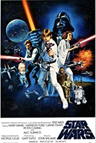
The next opening scene I chose was "Star Wars," which is in the drama genre but it is also Sci-fi. All of the people who helped with the film's production were included in the opening scene. This includes the casting designers, make-up artists, and so on. The titles were printed in a very subtle manner on the opening scene. This was advantageous because I noticed them, but they did not divert my attention away from the background. The opening scene featured a variety of images. These images are not static, but rather move slightly. These images depict all of the planets. This makes me want to watch the entire film. The images were all in space, with yellow writing explaining them in the background. This piece of writing depicted the past. It's almost as if it's setting up the film by explaining the heinous events of the past. As the images flip from one to one, this is done extremely well. It contributes to the sci-fi atmosphere by including objects that are not c...

title research: rango

Image
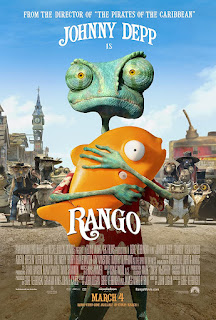
  During the opening scene of Rango titles displayed include, written by, directed by, produced by, produces, designers, ect. . Different animals that will play characters later in the drama are prioritized in the images. This opening sequence is one of a kind. It features minimalistic imagery and pictures. The work has rich colors and contrasts, and it appears to have been painted or sketched. Music and western vibes are two themes that appear in the video. It's almost as if we're in the 19th and 20th centuries. There is a darkness and eariness that is revealed underneath some titles, creating feelings of drama. "Amazingly, Rango's end credit sequence and opening titles were completed in just a few weeks," according to the website, "yet the project allowed for a lot of unique and innovative concepts." This opening sequence has benefited greatly from technological advancements. This is due to the fact that everything was done digitally. Fade in and...

Title research: Little Women

Image
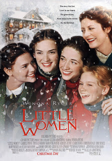
 For my first title research blog I am doing Little Women. Little Women is under the categories of drama and romance movie. The opening scenes and titles create a serene yet suspenseful type of mood. It gives off a royal and fairy type of vibe with the fonts and background. The background display is renaissance art and the font of the titles is exactly what I would imagine writing looked like with those fancy feathered pens that princesses wrote letters with back then. The color contrast between the black background color, light blue renaissance art, and the big and bold white lettering is pleasing to the eye and contributes to the overall mood as well. The music in the background is nice and delicate. It matches the background imagery very well and creates a gentle aura. I like the sense of relaxation and royalty. Some background images contain swirls and others contain vintage looking books, alluding to a sense of comfort. Every transition is a fade in and fade out slowly, c...

title research part one

Image
  While browsing the " Art of The Title" website, I discovered that editors and directors employ a variety of strategies. I discovered that not all credits need to be lengthy and tedious. Over funny and entertaining videos, credits and titles can be overlapping. A film can be made more entertaining by combining visual effects and titles. Filmmakers began to generate better advertisements as the advertising culture grew. One example is the use of titles. When it comes to the top ten title sequences, those with color, layers, and emotion receive the most positive feedback. Furthermore, titles do not have to contain only one scene. Many of the titles displayed on the website include multiple photos and sequences from the films. This does not condense the cast and credits into a single section.